
Welcome to an in-depth exploration of candlestick charts, the anatomy of candlestick to be more specific, a vital tool in the trader’s arsenal. This comprehensive guide will take you through the history of trading bookkeeping, the creation of candlestick charts, their significance in trading analysis, various candlestick patterns, timeframes, other types of charts, and culminate in a balanced view of their role in modern trading strategies.


Introduction: The Historical Evolution of Trading Bookkeeping and Candlestick Charts
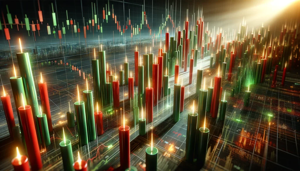
The journey of trading bookkeeping has been one of constant evolution, culminating in the invention of the candlestick chart. This innovation traces its roots back to 18th-century Japan, where rice trader Munehisa Homma developed this technique to track market prices. Unlike simple line charts, candlestick charts provide a visual representation of price movements within a specific timeframe, offering insights into market sentiment and potential future trends. This historical breakthrough has since become a cornerstone of technical analysis in trading.
The Pivotal Role of Candlestick Anatomy in Trading
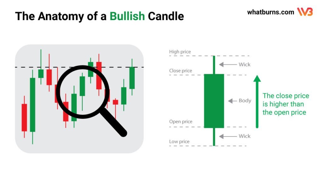
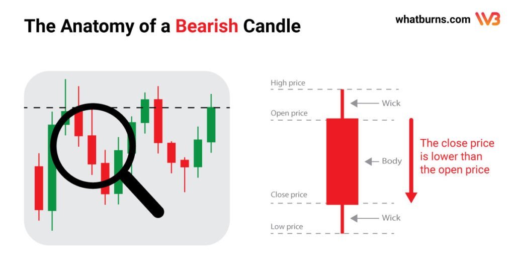
Candlestick charts have revolutionized trading analysis and forecasting. They consist of ‘candles’ with a body and wicks (or shadows). So let’s have a look at the candlestick anatomy: The body represents the open and close prices, while the wicks show the high and low. A candle can be ‘bullish’ if the close is higher than the open, usually colored white or green, or ‘bearish’ if the close is lower, often colored black or red. This setup provides a comprehensive view of market trends, capturing four key price points within specific periods and offering traders indispensable insights for informed decision-making.
Understanding Timeframes in Candlestick Charting
Timeframes play a crucial role in the analysis of candlestick charts. Each candle represents a specific duration of trading activity, which can range from minutes to days or even months. Shorter timeframes can offer insights into immediate market reactions, ideal for day traders, while longer timeframes help in understanding broader market trends, beneficial for long-term investors. Choosing the right timeframe is crucial as it can greatly influence trading strategy and risk assessment.
Exploring Other Types of Charts
In addition to candlestick charts, traders also use other types of charts for analysis:
- Line Charts: The simplest form, showing only the closing prices over a set period.
- Bar Charts: Similar to candlesticks but represent price movements with simple bars.
- Point and Figure Charts: Focus on significant price movements, disregarding time.
- Renko Charts: Based on price changes of a predetermined amount, ignoring time.
Each chart type offers unique perspectives and can be used in conjunction with candlestick charts for a more comprehensive analysis.
Bullish Patterns: Signs of Market Optimism
Candlestick charts – based on the candlestick anatomy – are renowned for their ability to highlight bullish patterns, signaling upward trends and market optimism. Some of the most famous bullish patterns include:
- The Hammer: Characterized by a short body and a long lower wick, indicating a rejection of lower prices.
- The Bullish Engulfing: A pattern where a large bullish candle completely engulfs a smaller bearish candle, suggesting a shift in market sentiment.
- The Morning Star: A three-candle pattern signaling a reversal from a bearish to a bullish market.
Bearish Patterns: Indicators of Market Caution
Conversely, bearish patterns on candlestick charts indicate potential downward trends. Key bearish patterns include:
- The Hanging Man: Similar to the hammer but occurring at the end of an uptrend, hinting at a potential reversal.
- The Bearish Engulfing: A large bearish candle engulfing a smaller bullish one, often seen as a precursor to downward momentum.
- The Evening Star: A three-candle formation that signifies a shift from bullish to bearish sentiment.
In What Type of Trading is the Candlestick Chart Being Used
Candlestick charting is not limited to a specific type of trading; it’s used across various styles, including day trading, swing trading, and long-term investment strategies. Its versatility and depth of information make it an invaluable tool for traders in stock markets, forex, commodities, indices, shares, and even cryptocurrency trading.
Conclusion: The Balanced Importance of Candlestick Charts
In conclusion, while candlestick charts and patterns offer critical insights into market trends and trader psychology, they are not foolproof. Relying solely on candlestick patterns for trading decisions can be inefficient. A holistic approach that includes other types of market analysis, such as news and sentiment analysis, is essential. This balanced approach ensures that traders consider all relevant factors, providing a more comprehensive view of the market and leading to more informed and effective trading strategies. The true power of candlestick charting lies in its integration with other analytical tools, making it an indispensable component of a well-rounded trading strategy.